
part 01: The problem
A balance of structure and play.
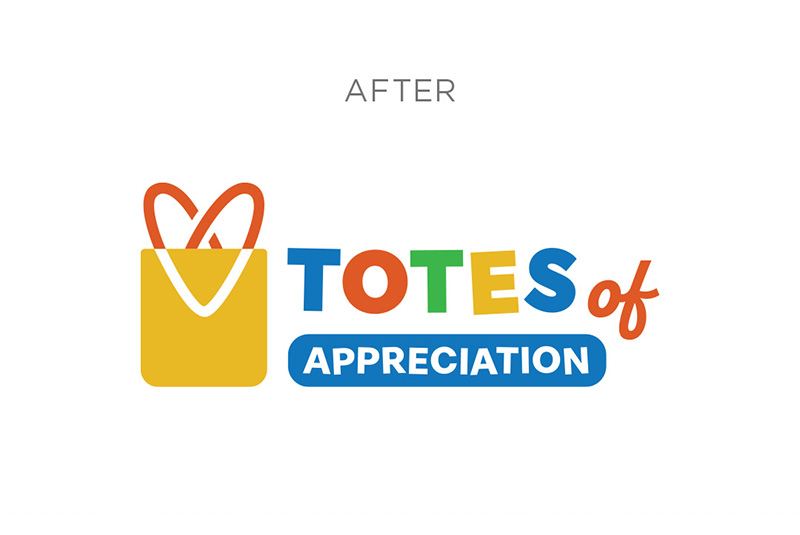
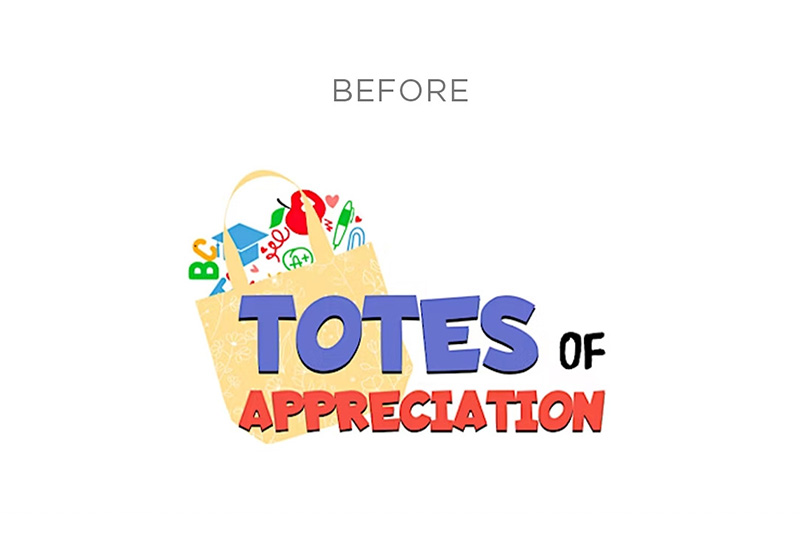
For this redesign, the goal was to clean up the busy logo, while preserving the elements that those involved with the organization already recognized and trusted, and give it the flexibility needed for today's digital and print applications.
In the updated design, we refined the typography and color palette while keeping the playfulness, simplified the central tote bag while adding an interconnected heart in the straps, and created a cleaner, more balanced composition. We then repurposed the supplies into a custom pattern to use on branded assets. The new logo is more versatile across different platforms, scales beautifully from social media profiles to large-format banners or presentation screens, creates a stronger connection with the audience, and provides a solid foundation for future growth.
part 02: the solution
Creating Moments of Delight.
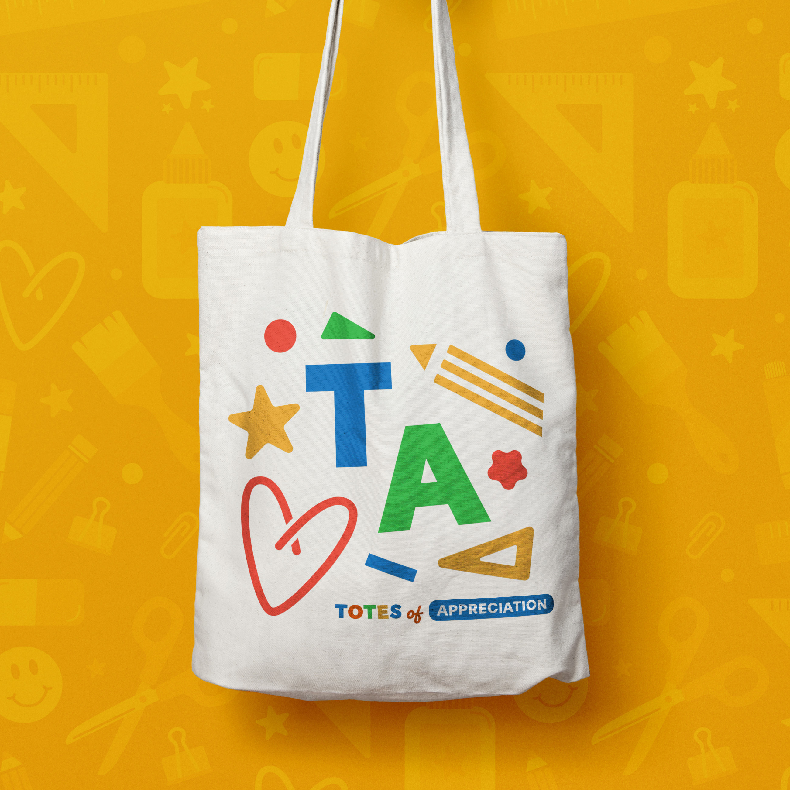
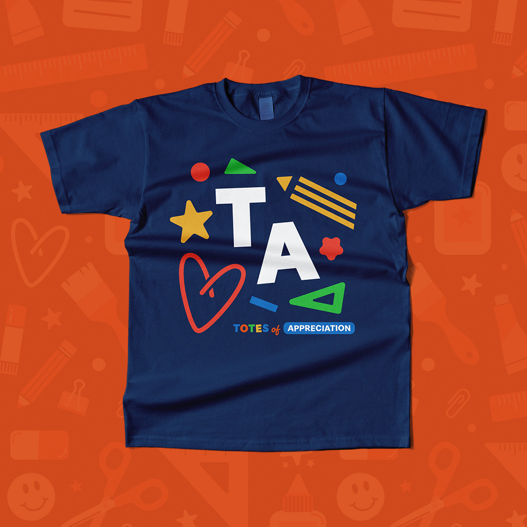
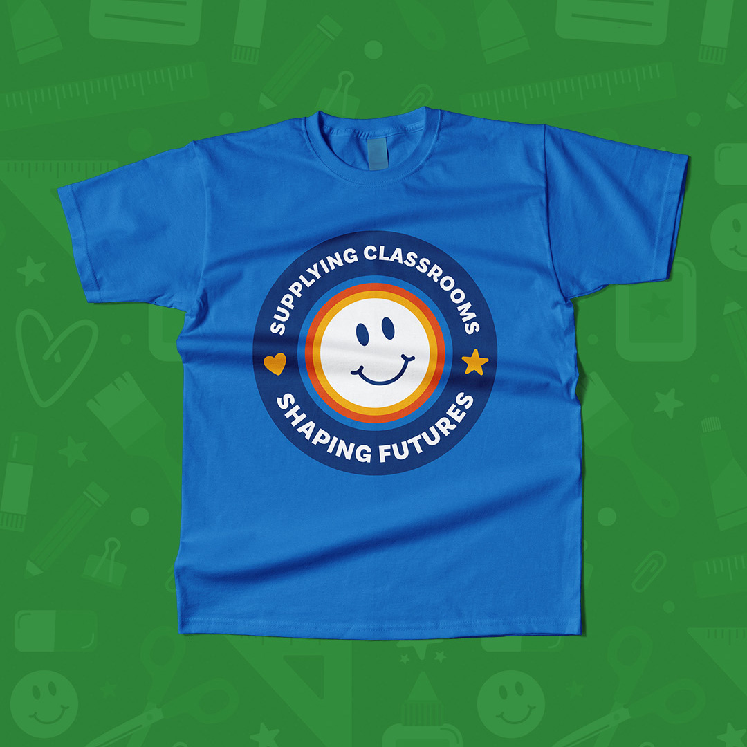
The designs expand upon the visual language of the brand through custom illustrations, color, and symbolism, setting the organization up for success at their supply tote giveaway events. The result is a cohesive collection of assets that feels both functional and meaningful, an extension of the organization's commitment to supporting educators and building brighter futures together.



part 03: The Engagement
Tailormade web experience
The Totes of Appreciation website was built to help visitors understand the organization and guide them to take action in support of teachers. Playful design elements represent the school-age students that the organization ultimately supports and keeps users engaged, while the page hierarchy clearly communicates the impact.
