part 01: The problem
Come as you are.
Fairlawn-West approached us to create its new brand identity—one that reflected the values that its congregation lives out proudly. The goal was to design a warm, approachable, and timeless visual identity that embodied the church's welcoming spirit. Before exploring visual concepts, we focused on understanding the church's identity beyond its services. Conversations centered around themes of peace, compassion, acceptance, and community. Rather than creating a traditional church logo, we wanted to develop a symbol that reflected both faith and human connection.
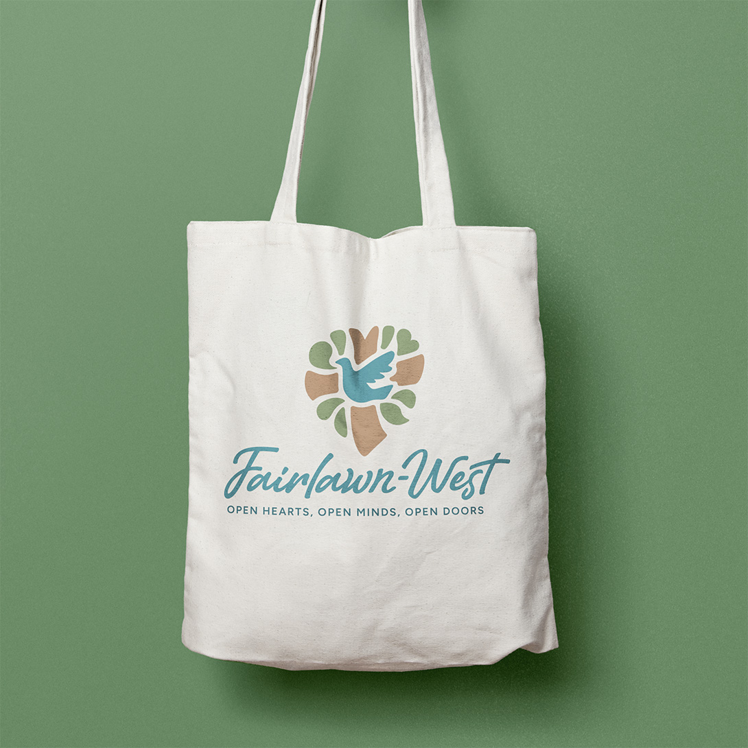
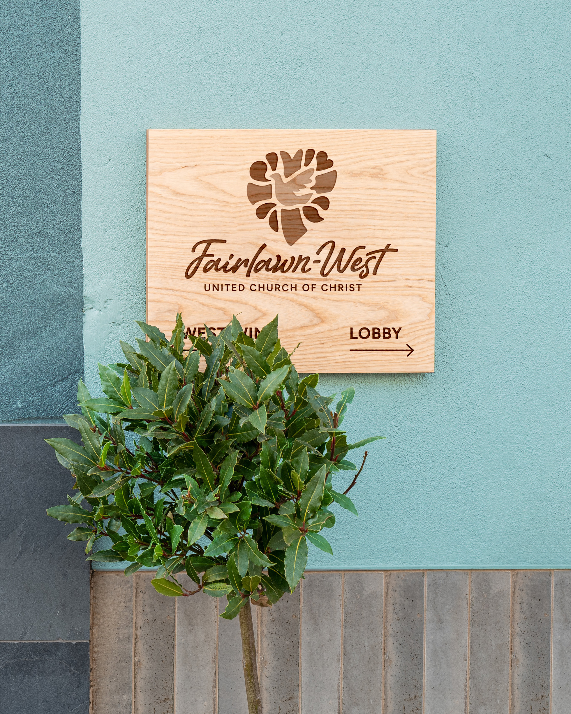
The final identity combines meaningful symbols into one cohesive mark: a central dove and cross represent peace, hope, and faith; leaves symbolize growth and renewal; and a speech bubble reflects conversation, fellowship, and inclusivity. Together, these elements form the shape of a heart, reinforcing the church's commitment to love, compassion, and welcoming people from all walks of life.

part 02: The solution
A peaceful and purposeful palette.
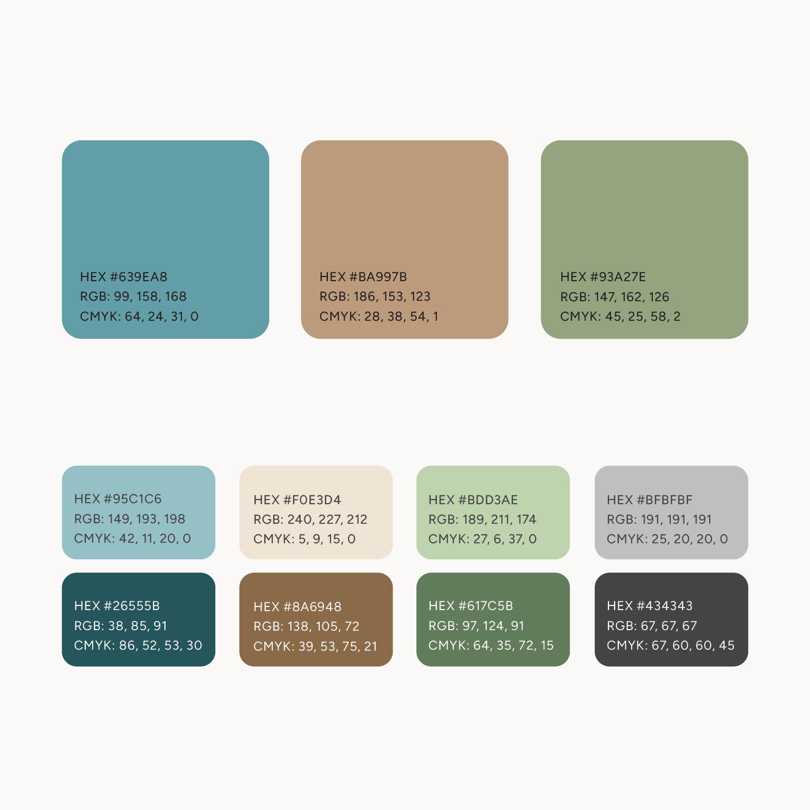
To complement the symbolism of the logo, we selected a palette of calming, nature-inspired colors. Soft greens and earthy tones create a sense of peace and renewal while helping the church's brand feel inviting and approachable. The color choices allow the identity to communicate warmth and authenticity rather than formality.
part 03: the deliverables
Plenty of love to go around.
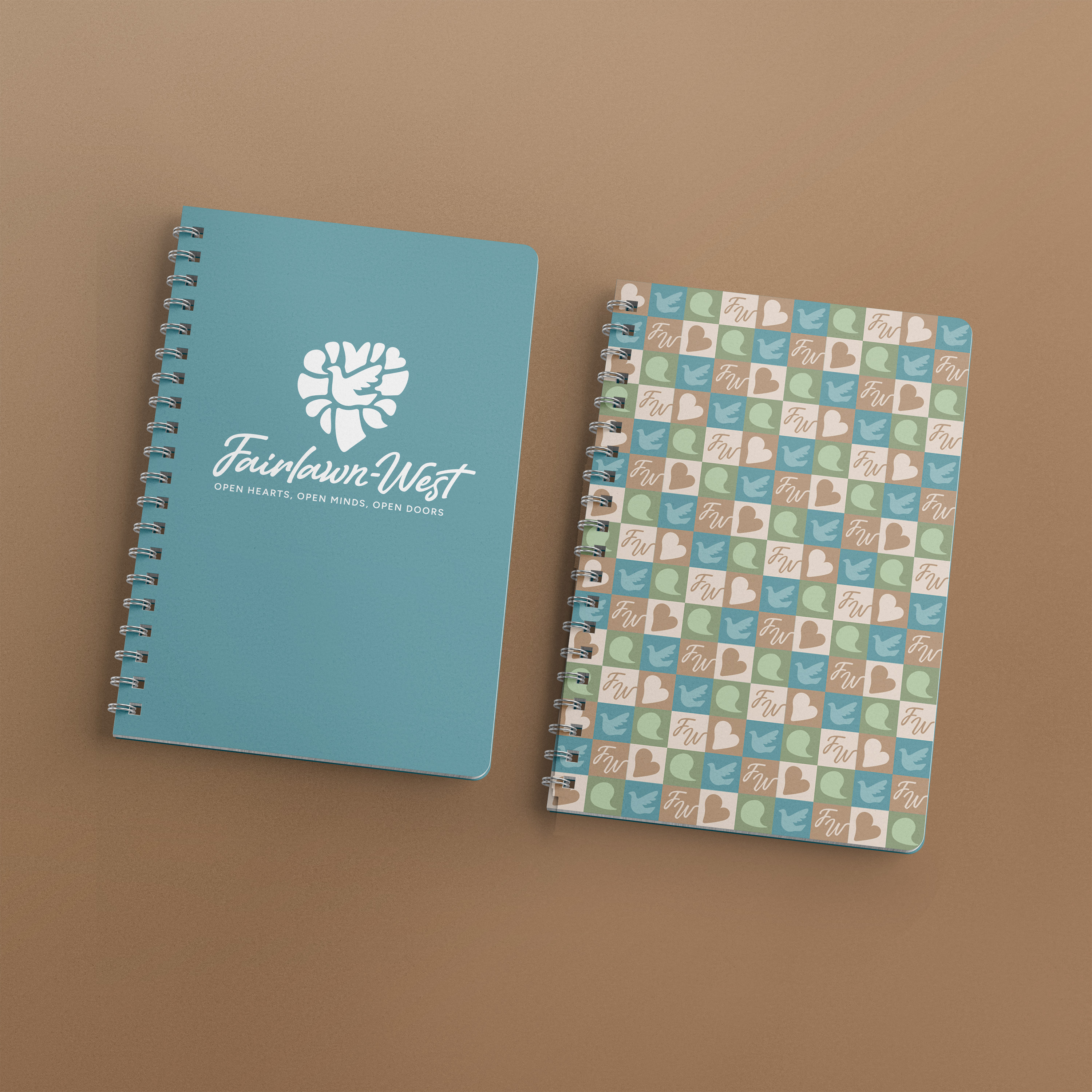
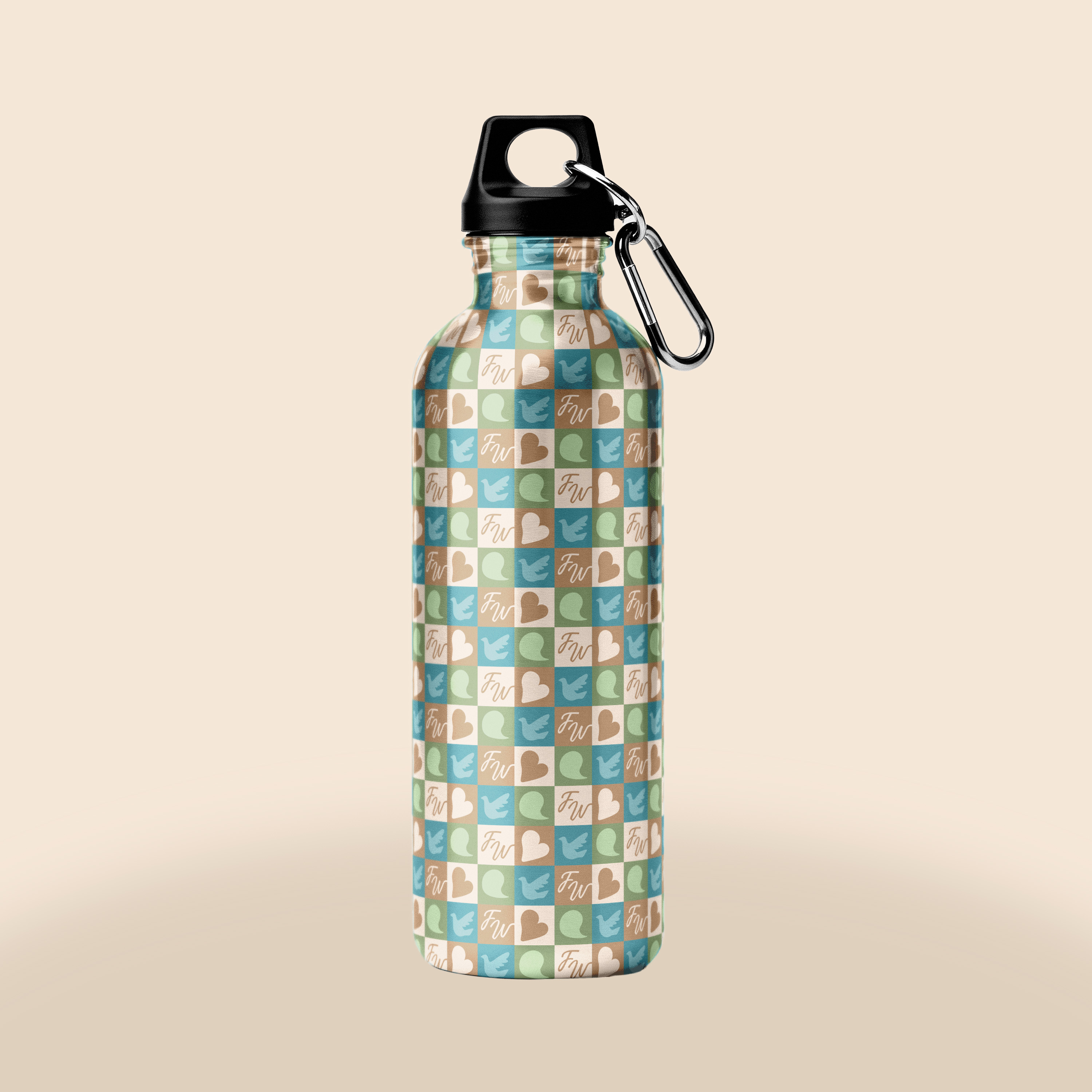
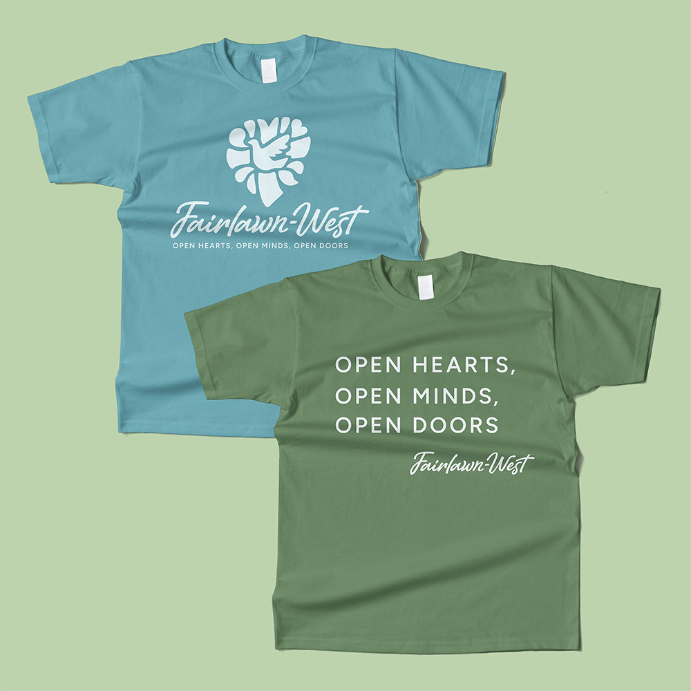
To demonstrate how the brand could live beyond digital and print materials, we developed a collection of branded merchandise including t-shirts for volunteers and church events, reusable water bottles featuring the new identity, and Bible reading bookmarks that members could use during personal study or group sessions.
These applications helped establish a cohesive visual language while giving the congregation practical items that encourage connection and reinforce the church's mission.