
part 01: evolution of a leaf
Sometimes, more of you is all it takes.
Greenleaf has made their mark on many individuals and families in the over 100 years they have been in service. Their services and the clientele that visit them are unique, but their logo didn't fully capture this.
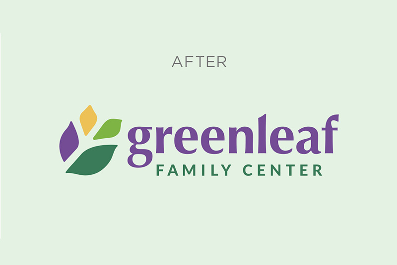
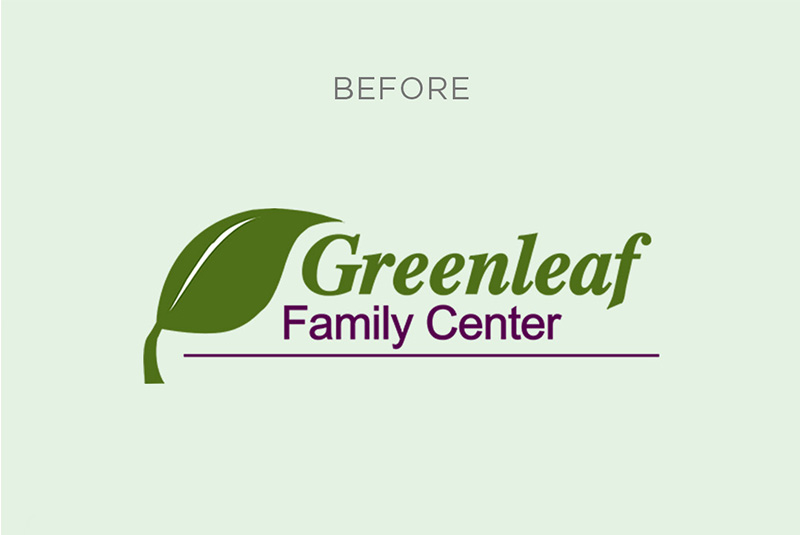
By expanding on their main leaf, building out a fresh new color palette and giving their typeface a friendly upgrade, we helped them reinvigorate the way they present their organization in the community.
part 02: the beauty in the details
Less clinical, more compassionate.
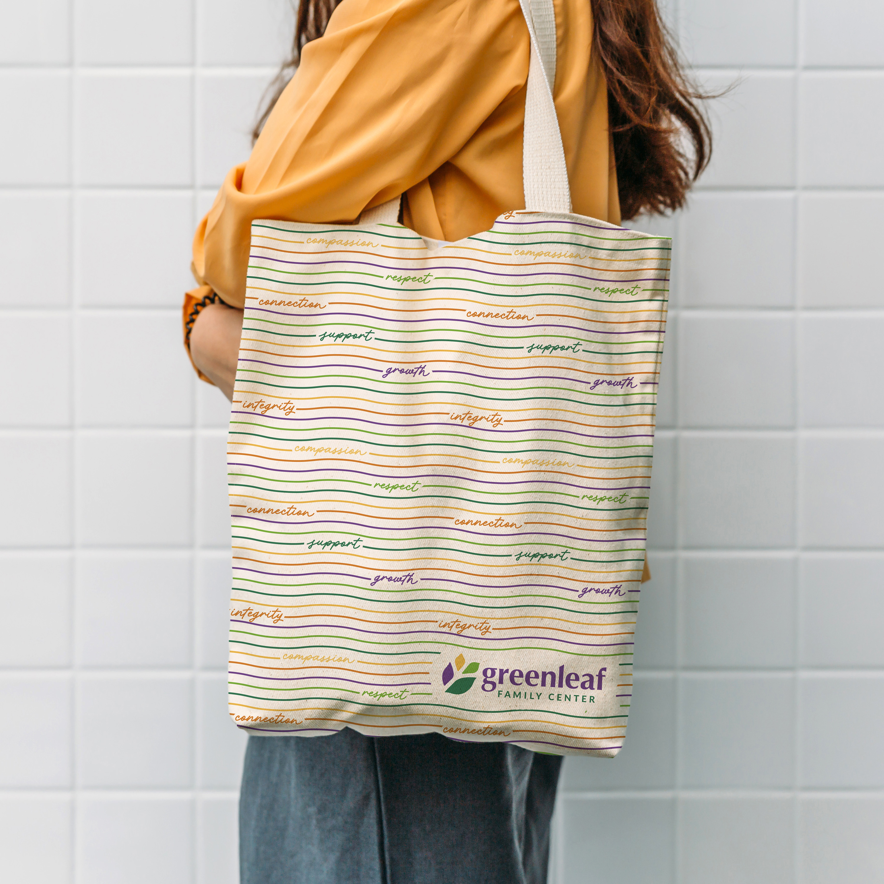
We carried Greenleaf's values into their brand voice by incorporating them into custom patterns used throughout their printed assets. The patterns – set in their new expanded color palette – convey diversity, community, and support, and help the organization feel friendly and personal.

part 03: Consistency
Brand transformations for a timeless mission.
We knew we had to retain what made Greenleaf special. They have been serving the Greater Akron community since 1912, after all.
Through patterns and color palettes, Greenleaf remains a staple of care while stepping out into the community they have historically served with renewed energy. Their new brand will carry through endless applications with the same consistency they have held for their service to Akron adults, children, and families.


part 04: the fun stuff
How the brand exists to those it touches.
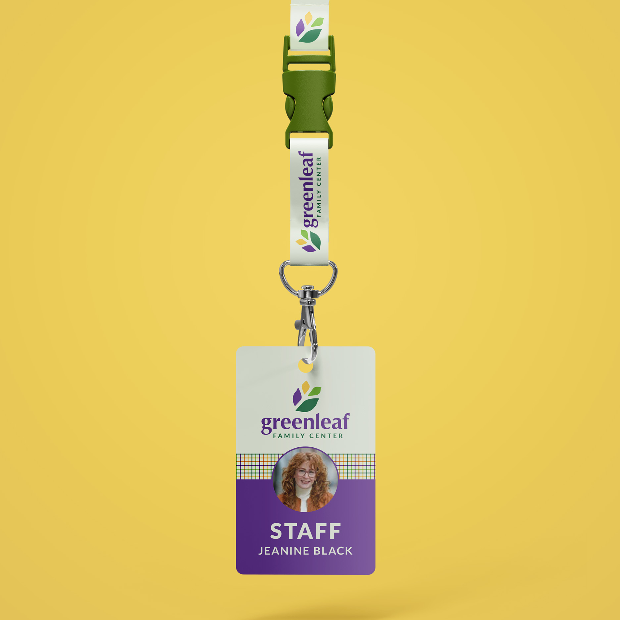
The new look and feel allowed us to reimagine how the organization can present itself to those it serves. We gave a fresh look to staff business cards, lanyards, shirts, and used the custom patterns to design tote bags and pillows for Greenleaf's waiting room and office chairs.
Each touchpoint becomes a branded moment for the family waiting for care or the donor looking to give back. The new brand is as tangible as the material on which it's printed.