


If color theory and color psychology have taught us anything, it's to choose wisely. In fact, it’s often the first thing people notice about your brand. At a glance, without saying a word, color conveys symbolic meaning and emotion.
Color is light and energy. It’s the intersection of art and science. So, it’s no wonder that strategic use of color impacts customer engagement, sales and brand loyalty. Transversely, the wrong color has the potential to be confusing and off putting. We use these principals when designing logos, branding, and just about everything we do.
Technically, your brand can be any color on the spectrum - you can go buck wild on it if you want. But choosing the appropriate color can be the difference between an effective brand and one that turns people away which is why it's important to consider your audience and how you want to be perceived.
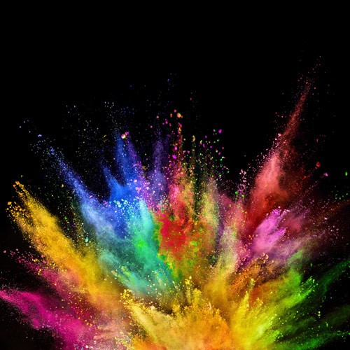
While there are in-depth studies into color usage and subliminal messages, we'll just be running through your basic Crayola 8-pack today. We'll even throw in two additional colors, call it a gift.
RED: Physical
Quality: Attention Seeking
Symbolism: Passion, Boldness, Drama
Mood: Excited
Affect: Enthusiasm, Anticipation
Industries: Children’s Products, Food, Sports, Fire Protection
Brands: Coca Cola, Target
The color red has a wide range of connotations to a worldwide audience. In China, red symbolizes good luck but is symbolic of mourning in South Africa. On Wall Street “in the red” suggests you’ve lost money. Before you throw your favorite shade of red onto a logo or some branded material, make sure your audience is going to respond in the way you want them to.
If your audience is a herd of bulls, maybe avoid using red altogether. We're assuming cartoons are a good source for facts.
ORANGE: Warmth
Quality: Friendly
Symbolism: Creative
Emotion: Cheerful
Affect: Optimism
Industries: Arts & Entertainment, Sports, Transportation
Brands: Nickelodeon
Orange is a fun color but also symbolizes caution. It's Halloween in a nutshell: "Go children, have fun and collect candy. But look out for ghouls!"
YELLOW: Emotional
Quality: Fun, Energized
Symbolism: Happiness
Mood: Enthusiastic
Affect: Invigorated
Industries: Food, Sports, Travel
Brands: McDonald’s
According to studies, yellow stimulates memory. But other studies report that babies cry more in bright yellow rooms and tempers are more likely to flare. Touches of yellow add a joyous feel, but too much yellow can become overwhelming. If you've ever woken up to too early to a bright sun, you understand this feeling.
BLUE: Intellectual
Quality: Responsible
Symbolism: Honest
Mood: Hopeful
Affect: Reflection
Industries: Health Care, Security, Entertainment, Technology, Communication
Brands: Facebook, Twitter, PayPal
Blue is the most common favorite color worldwide. But it is also the least appetizing color. This is because there are very few naturally occurring blue foods, and if you happen across one you would consider it poisonous or dangerous. If your brand is food related, maybe avoid the color blue.
GREEN: Growth, Balance
Quality: Revitalized
Symbolism: Money, Outdoors, Organic
Mood: Calm, Relaxed
Affect: Harmonious, Positive
Industries: Environmental, Agriculture, Banking
Brands: John Deere, Starbucks, Whole Foods
Because of its spectral wavelength, green is the most relaxing color to the eye, optically. It’s known to help alleviate depression, nervousness, and anxiety. Most things in nature are green: grass, trees, plants, ya know, nature stuff. It's this connection to nature that calms us. If you want your brand to be perceived as a reassuring and relaxing, consider green.
PURPLE: Awareness
Quality: Imaginative, Nostalgia, Luxury, Value
Symbolism: Spiritual, Royalty
Mood: Sentimental, Intrigued, Inspired
Affect: Uplifted
Industries: Creative Industries, Luxury Goods
Brand: Hallmark, Taco Bell, Twitch
Purple is the balance of red's physical and blue's intellectual components. It balances the mind and can even trigger creativity. It's not used as often as other colors in branding so when it is used those brands are perceived as creative. If you're looking for a touch of instant creativity in your brand purple might be a good place to start.
PINK: Love
Quality: Romance, Compassion, Sensitivity
Symbolism: Feminine
Mood: Playful, Tender
Affect: Soothing, Nurturing
Industries: Children, Beauty, Fashion
Brand: Victoria’s Secret
Pink is typically associated with feminine qualities like kindness, nurturance, and compassion. It's soothing in a maternal way. There have been several uses of the color pink to calm people and make them less energetic, such as painting "drunk tanks" and opposing team locker rooms.
BROWN: Solid
Quality: Stable, Reliable
Symbolism: Earth, Organic
Mood: Trusting
Affect: Grounding
Industries: Transportation, Agriculture, Construction
Brands: UPS
Brown evokes images of mountains and rock, so people perceive it as solid, consistent, and safe. Great for a brand that is building something that lasts like construction. if your product needs to be perceived as solid and long lasting, we might suggest something in brown.
BLACK: Sophisticated
Quality: Mysterious
Symbolism: Power, Authority, Strength, Glamour
Mood: Inquisitive
Affect: Aspirational
Industries: Luxury Goods, Fashion
Brands: Christian Dior, Tom Ford
Black is sleek and mysterious. It's the little black dress you pull out when you want to show off. It's a tuxedo that only comes out when you need to impress someone or just feel really good about yourself. Looking to make an impact and be remembered? Slip into something black.
WHITE: Purity
Quality: Perfection
Symbolism: Purity
Mood: Confident
Affect: Certainty
Industries: Technology, Scientific, Pharmaceutical
Brand: Apple
In paint, white is the absence of color. It's clean and pure. On a screen or in light, white is the collection of all colors. It's completion and wholeness. Whichever way you look at it, white is a powerful color that conveys perfection and purity. Now, whether any brand can actually achieve perfection is a completely different and philosophical question. But if that is the perception you're looking for, white is your color.
Colors in Practice
One example of a logo we recently rebranded is the Sugar Plum Tour, Akron’s holiday home tour and premier fundraiser of the Gay Community Endowment Fund. This playful logo nods to the popular holiday tradition, The Nutcracker ballet, as well as the beloved holiday poem, A Visit from St. Nicholas. While it’s a given that the color purple is commonly associated with the fruit, it also adds a magical element to an already festive seasonal event. A fresh sprig of green adds a delightful twist of endearing, natural charm.
“Purple and green play well together because the combination symbolizes luxury and quality. In a nutshell, that’s the promise of The Sugar Plum Tour. Guests expect a grand and festive experience.”
-- Lia Fleming, Associate Creative Director