


On Tuesday, July 1, 2025, New York State Assemblymember Zohran Mamdani defeated former New York Governor Andrew Cuomo in the NYC Democratic Mayoral Primary.
Many people were surprised that Zohran was able to defeat Cuomo, considering he is less politically experienced, but it’s safe to wager that marketers and designers saw this coming, thanks to his bold and strategic campaign.
A Love Letter to New York
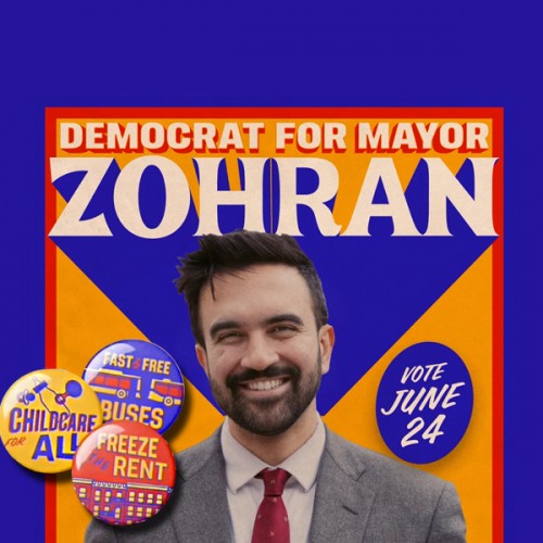
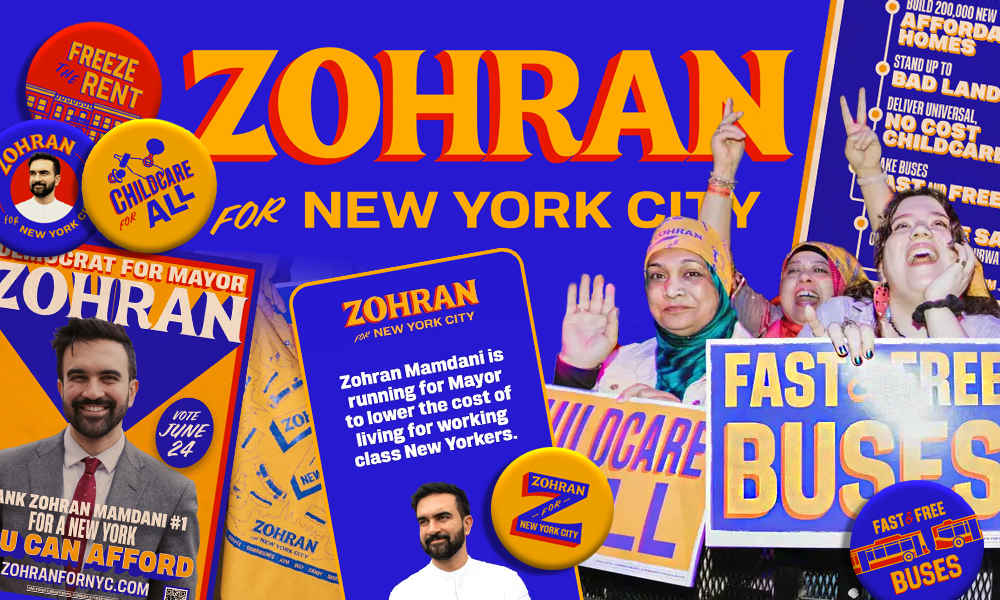
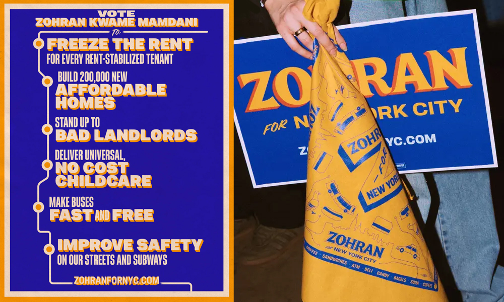
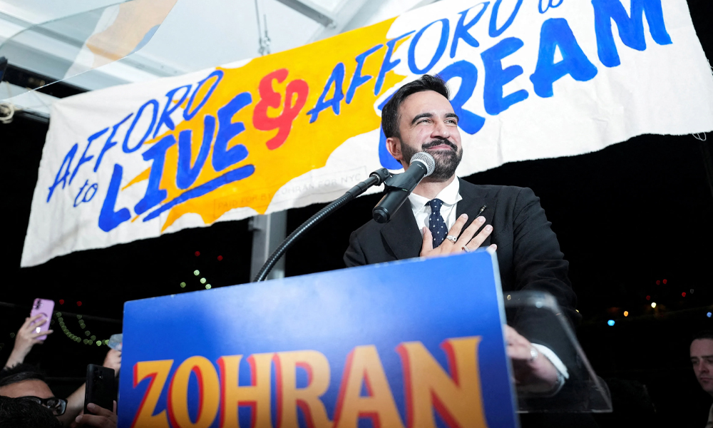
The Zohran Mamdani campaign has taken to the streets of New York city in an impossible-to-miss blaze of taxi-cab yellow, Mets blue, and fire-engine red. His branding challenges the status quo of political advertising with bold design elements inspired by NYC Metro iconography and hand-painted bodega storefront signage.
Zohran’s campaign is steeped in human touch that is so often missing in today’s political landscape, serving as a powerful reminder that politicians are servants to the people. These fun, playful colors, paired with a classic gothic font and straight-forward copywriting that gets Zohran’s message of a lower cost of living across quickly, create a perfect marriage of design and copy that make Zohran Mamdani’s branding memorable and loveable.
The MVPs
The main players on Zohran Mamdani’s branding team are Tyler Evans, a designer based outside of Washington DC who has worked on campaigns for other popular left-leaning democrats, including Bernie Sanders and Alexandria Ocasio-Cortez, as well as Aneesh Bhoopathy and Phil Ditzler, creatives at the Philadelphia-based design co-op, Forge.
Their design expertise allowed Zohran to dare to be different—his political stance is more progressive than other democrats, and his branding is more bright and playful than his competitors.
Z for Zohran, Zohran for NYC
Let’s take a look at Zohran Mamdani vs. Andrew Cuomo in the playing field of graphic design.
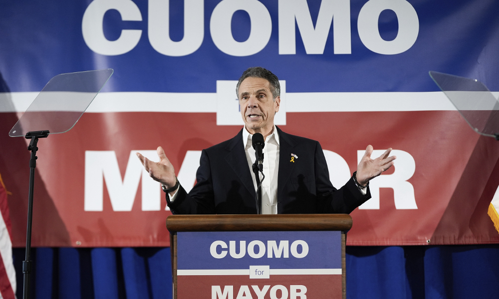
Zohran’s unique design draws people in, while Cuomo’s same-old design blends in with everything else. Zohran runs on his first name, following the recently-popular trend among democrats to use their first name or nicknames to seem more relatable and humanizing (think Hillary, Kamala, AOC, Bernie…). Cuomo runs on his last name—corporate, professional, and far removed from the average New Yorker. While Cuomo plays it safe to satisfy his target audience — the political establishment, Zohran’s brand appeals to the people of NYC.
If you’re afraid to challenge the norms of political branding, how are you going to challenge the political establishment? People are ready for change, visually and socially.
Zohran’s red, yellow, and blue color-scheme stands out among the sea of red, white, and blue political aesthetics—a breath of fresh air to left-leaning young people who often take Americana aesthetics as a red flag, disillusioned with American government. Authenticity to the candidate is everything, and Zohran Mamdani’s branding is authentically him, while with Cuomo’s design, you could replace “Cuomo” with any other politician's name and use it for their campaign, unchanged. Branding without substance is nothing, and substance without branding is nothing. It’s crucial to find the happy medium where a campaign is unique and brand-forward while still taking authentic action to make that branding a reality.
Connect with us!
Are you looking to use strategy-based, bold design to connect with your audience?
Contact TRIAD today to revolutionize your branding.