part 01: A brand built to grow
rooted in montessori.
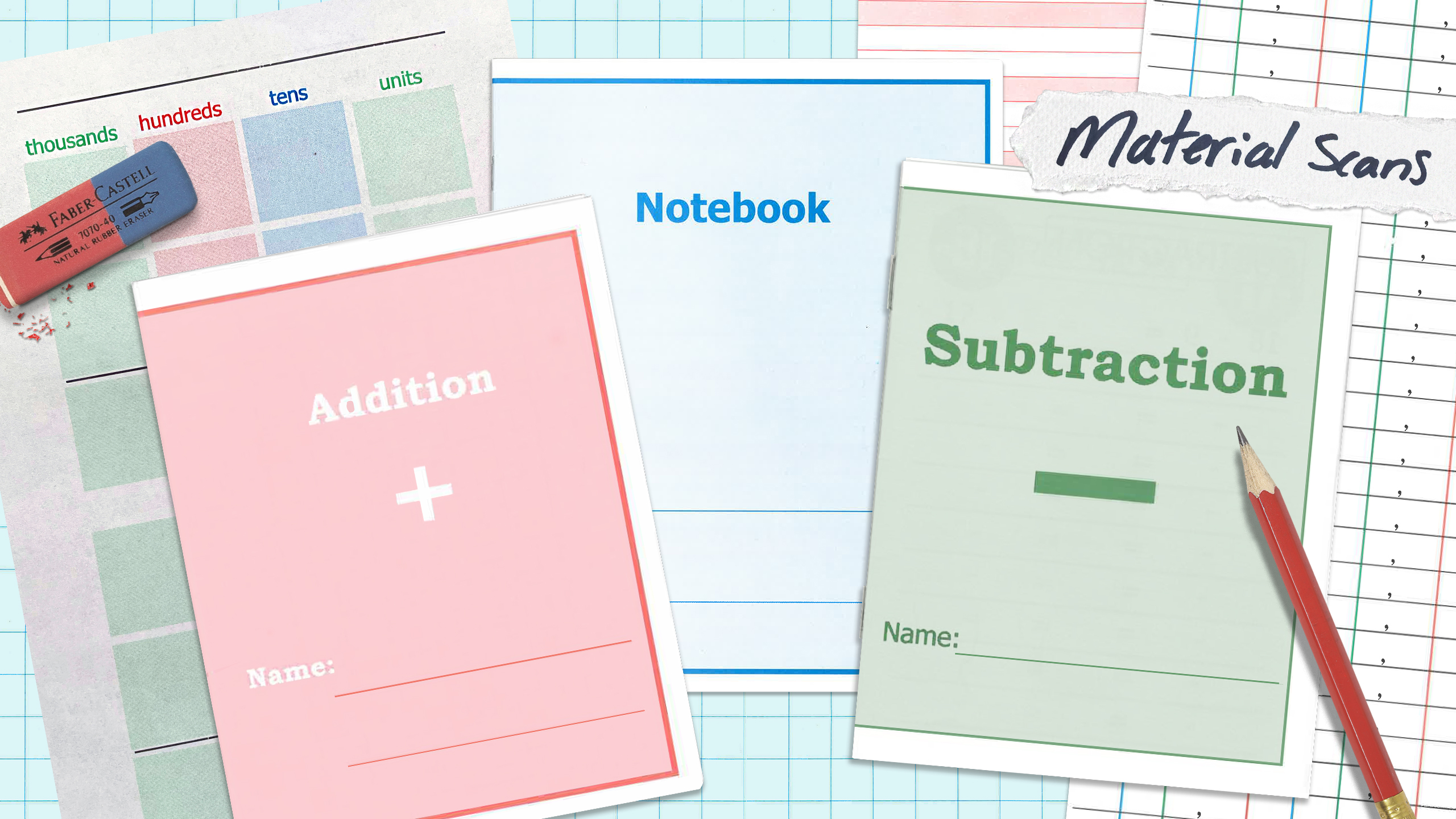
We set out to create a brand identity that felt credible and professional while still reflecting the hands-on, thoughtful nature of Montessori education. We started by researching the competitive landscape, looking at how Montessori schools and consulting services were presenting themselves today. Then, we went straight to the source. Our client brought in real Montessori educational materials, from math workbooks to handwriting practice paper, which we scanned and used as inspiration throughout the identity.
The result is a visual system that feels distinctly PDK, rooted in the materials and methods behind the work.
part 02: Making it tactile
Thoughtful in print
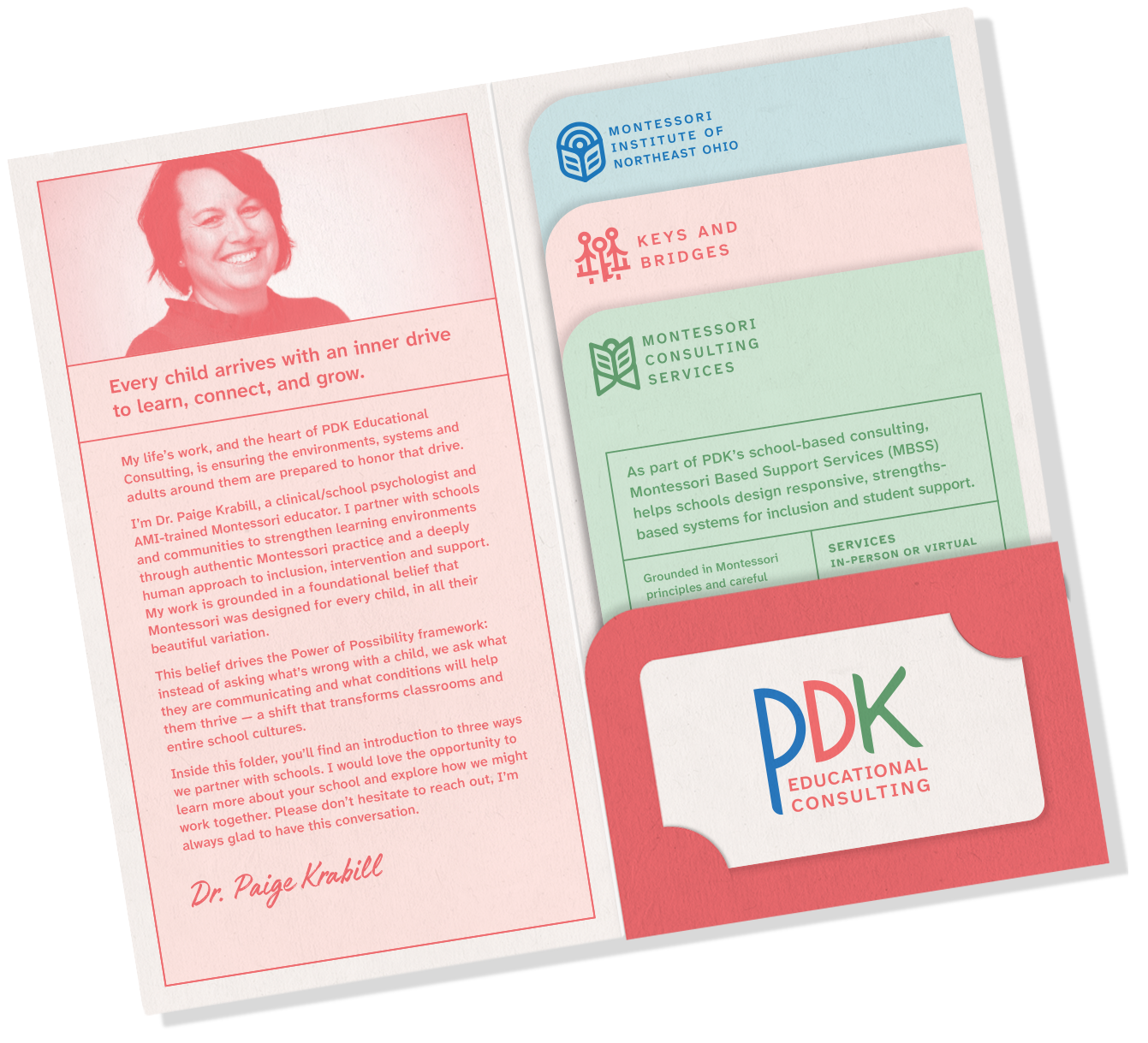
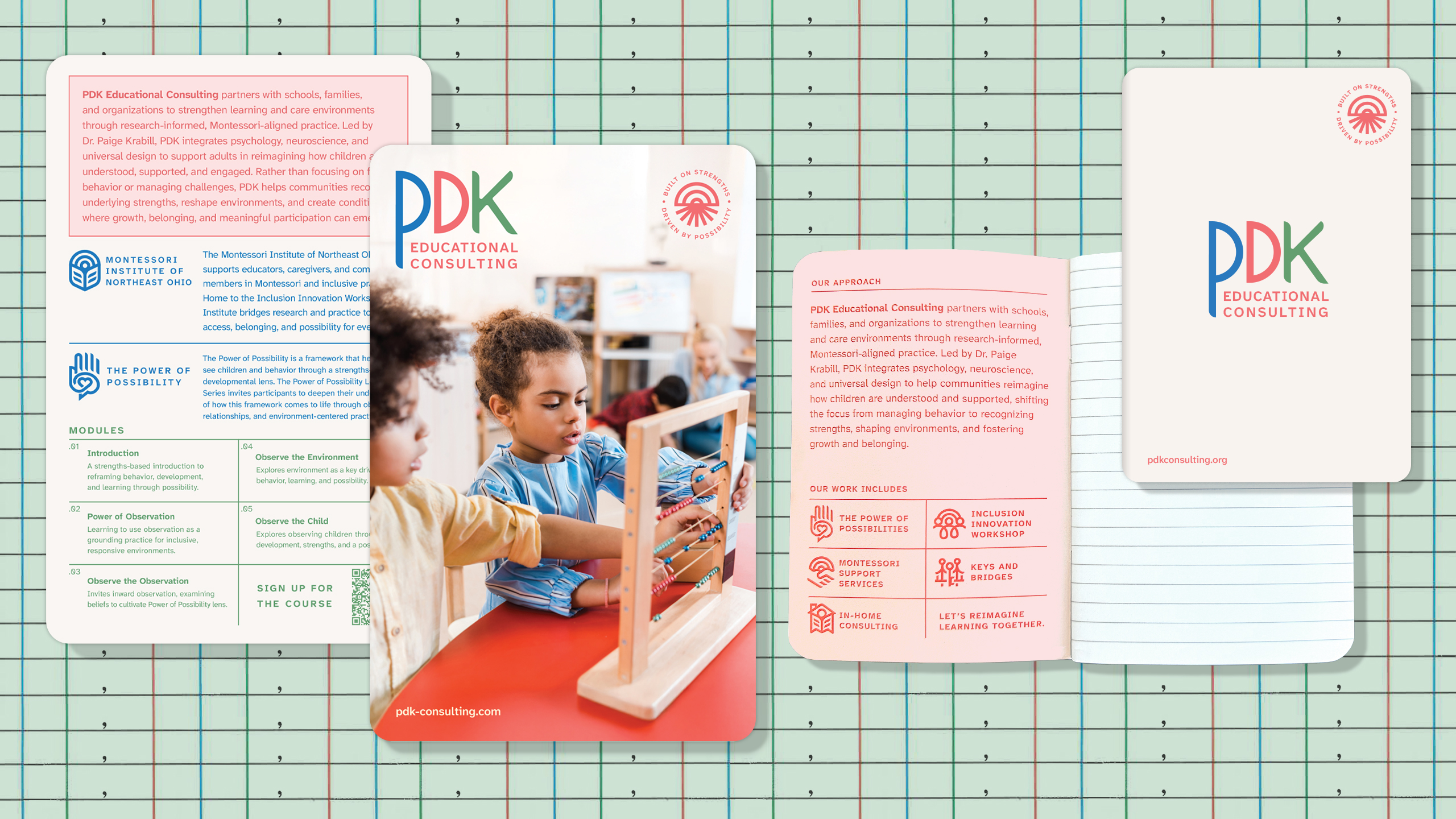
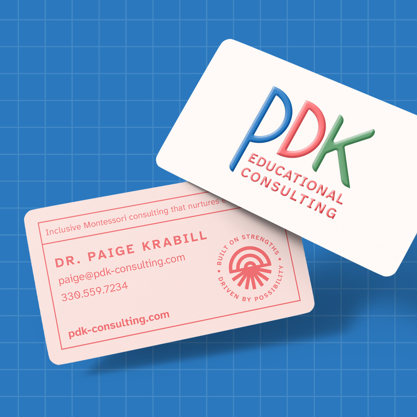
PDK’s printed materials bring the new identity to life through a soft primary color palette inspired directly by authentic Montessori materials. Color-coding helps distinguish PDK’s various services and offerings, making information easier to navigate at a glance. Rounded corners and soft-touch paper add a tactile, elevated quality to the pieces, creating materials that feel approachable and educational while still polished and premium.
part 03: Clear by design
Clarity at every click.
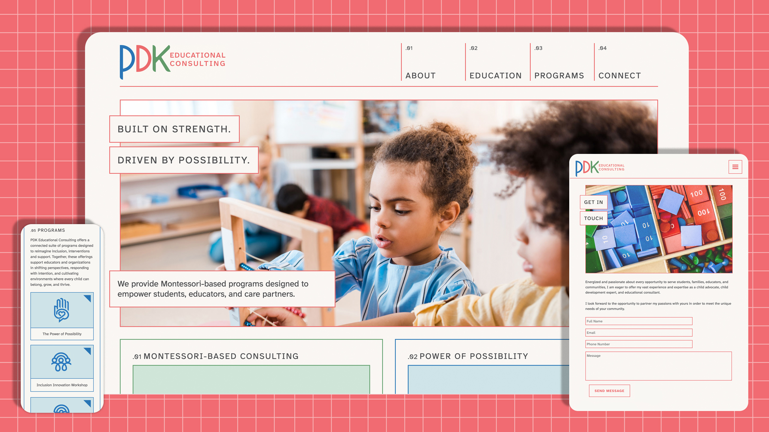
The website is often the first interaction someone has with a brand making it one of the most important pieces of the identity. We designed the experience to feel clean, professional and trustworthy while making a wide range of information easy to navigate. Color-coding helps organize PDK’s services and content into intuitive categories, allowing users to quickly understand what’s available and find what they need. The result is a digital experience that feels as thoughtful and approachable as the brand itself.
part 04: all under one roof
One system, many services.
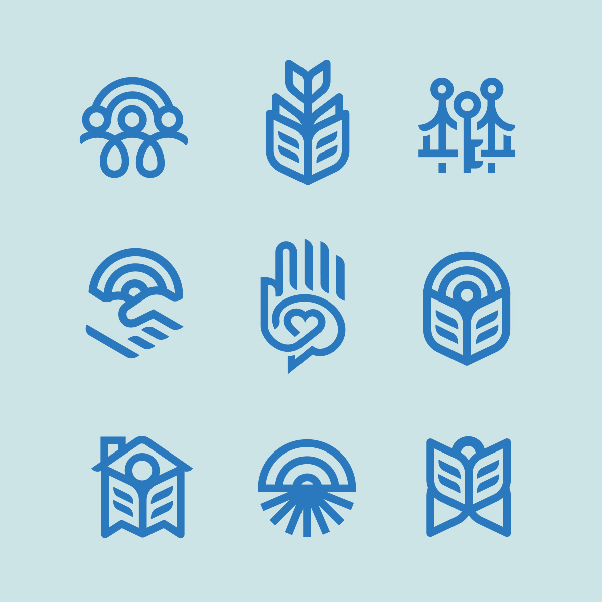
With so many audiences and offerings under the PDK umbrella, we needed a way to organize the brand without making it feel fragmented. We developed a comprehensive icon system representing PDK’s various services and products, from resources for teachers and students to offerings for school administrators, healthcare professionals and caretakers.
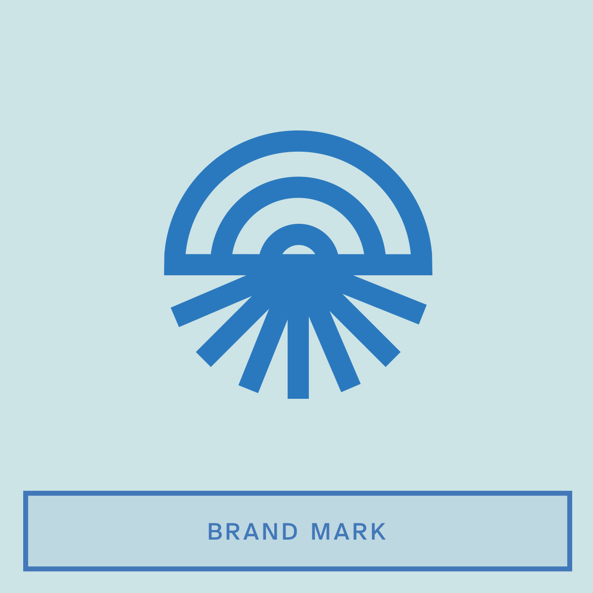
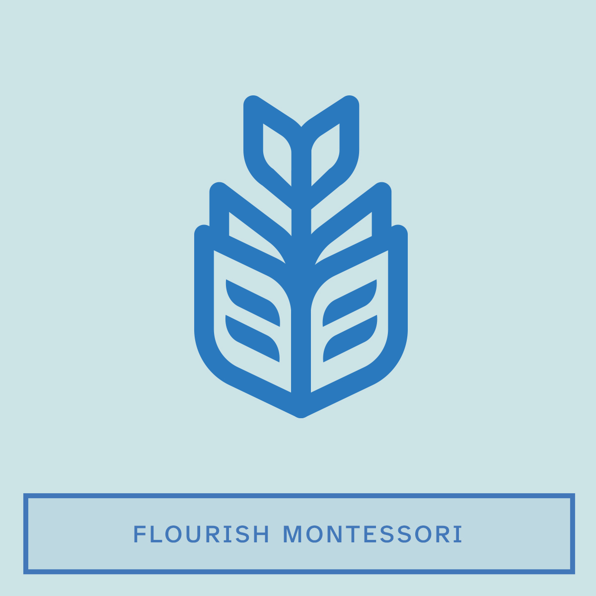
Each icon uses geometry inspired by the primary PDK logo, creating a visual connection across the entire system while giving each offering its own distinct personality.

part 05: ready for what's next
A brand system designed to evolve with PDK.
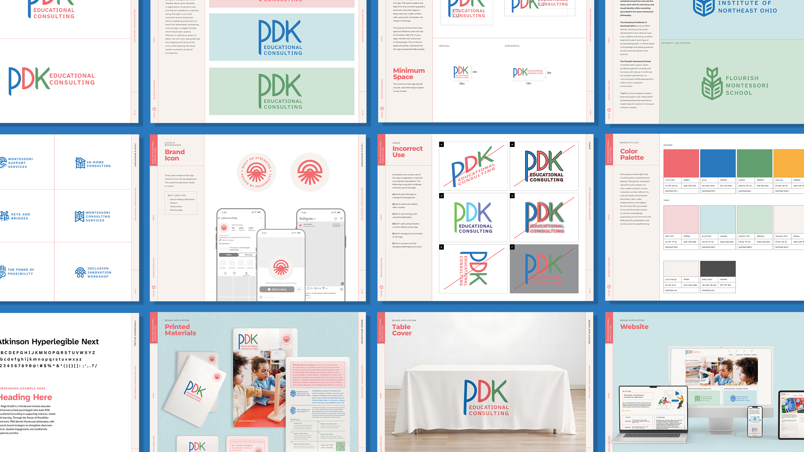
A strong brand needs the flexibility to evolve. We created comprehensive brand guidelines that give PDK a clear framework for using its identity consistently across every touchpoint, while leaving room for new services, audiences and opportunities. From color and typography to iconography, imagery and layout, the guidelines turn the new identity into an easy-to-use toolkit that can grow alongside the business.
part 06: more credibility
A professional brand opened the door to bigger opportunities.
The new PDK identity transformed the business from feeling like a small, emerging consultancy into a polished, credible brand ready to compete at a higher level. A more cohesive presence helped PDK attract new customers, build greater trust with its audience and establish the credibility needed to lease a physical space. The new identity also gave PDK the confidence and consistency to show up professionally at trade shows and industry events, creating a stronger first impression wherever the brand appears. What started as a visual refresh became a catalyst for real business growth.